published by adam on Tue, 10/09/2012 - 16:51
published by adam on Mon, 10/01/2012 - 00:05
published by adam on Thu, 09/20/2012 - 15:47
How Important is Hegel?!
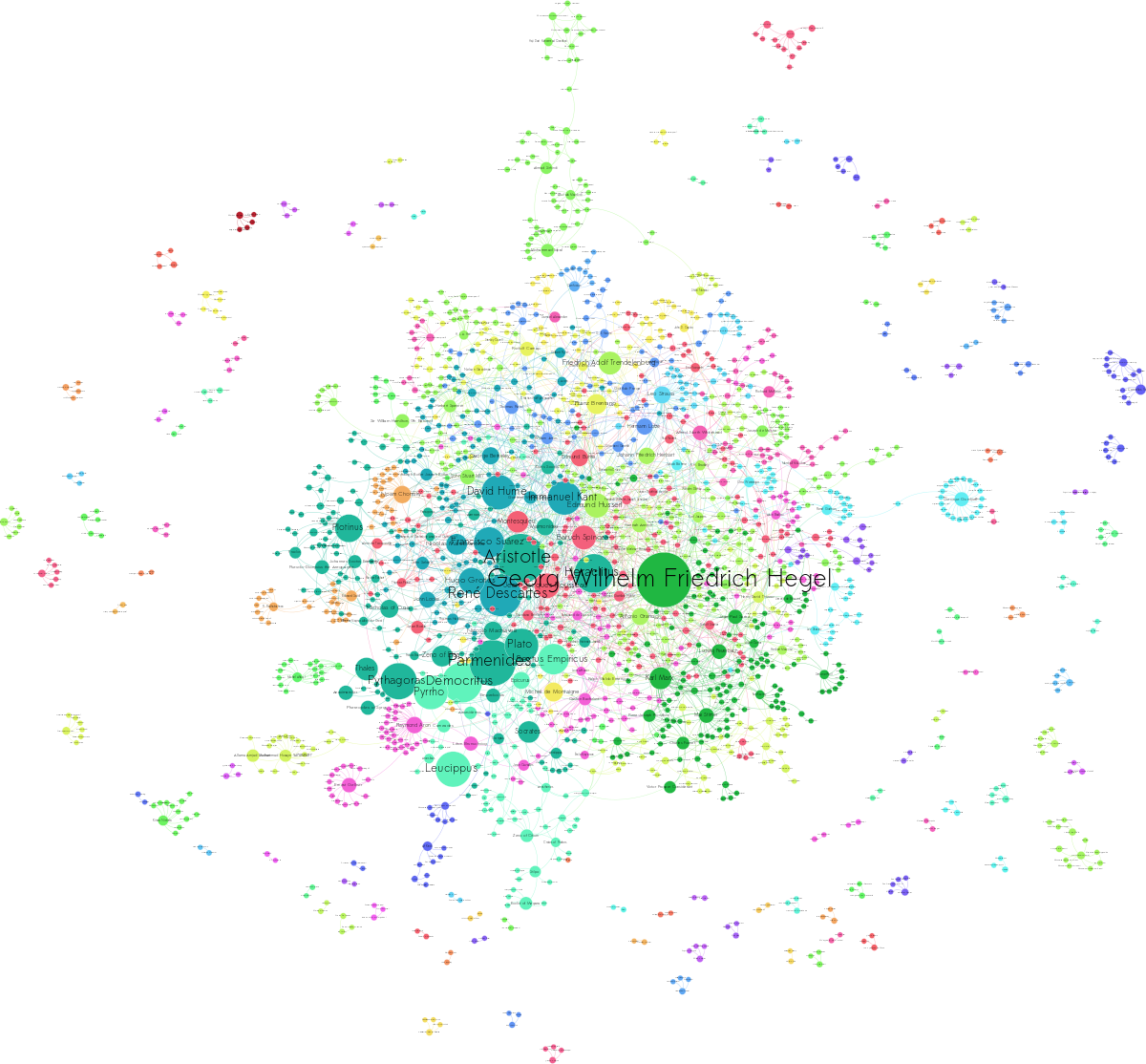
I was surprised I hadn't seen this graphic at Drunks and Lampposts made with Gephi until a friend posted it on facebook last week. The original is here, and here's my version:

Using a scrape of the data behind wikipedia's sidebar for philosophers, Simon Rapier put together a fantastic visualization of the schools and interconnections among philosophers. Griffsgraphs followed up by expanding the scrape to the entire network of influencers and influenced on wikipedia. Both of these are insightful humanities studies in graphs and visualization---even though the algorithm wasn't told which common ideas link Hegel and Marx, it saw that they were similar enough to be grouped together (shown by making them the same color), and that the way Hegel influenced, say, Husserl, was different enough to warrant another school, simply by observing a different group of people followed them.
That's a solid aggregation of a lot of humanities information. Who knew Skynet's tweed jacket had patches on the elbows?
However, looking at the original graphs on D&L and Griffs, I was struck that...
published by adam on Mon, 06/04/2012 - 20:31
In Part 2, we showed how to add recession shading to a plot of American Beards over time, and did some diagnostics to check whether 19th Century Americans grew recession beards. (Spoiler alert: it appears they did not.) In Part 1, we showed how to plot the series in the first place. Today, we're going to look at the beardly trend over the period. We all know about the gilded age popularity of mutton chops and sideburns, but were full beards on the rise or on the decline between 1866 and 1911? And more importantly, what can this period tell us about beards of the future (in the past)?!
What you'll learn
-
How to apply linear smoothing to a time-series plot in ggplot2
-
How to interpret that and how not to interpret that. (The difference between interpolation and extrapolation.)
-
Whether beards were getting "trendier" or trending less during the tail end of the 19th Century.
-
What date we're all going to have beards.
published by adam on Tue, 05/29/2012 - 13:18
In Part I, we showed how to plot a time series of the change in American beards over time, using a dataset from Robert Hyndman's time series data library. Today, we're going to look at whether the dramatic changes in American male beardfulness seem related to the economy. Did Americans grow recession beards in response to the Panic of 1873? Out of work, did they forgo their frequent trips to the barber (since Gillette didn't invent the personal safety razor until 1904 so they could do it themselves)? Did they go on their job interviews with a face full of mutton chops and just never get called back (by telegram)?
What you'll learn
-
How to apply recession shading, according to the NBER's recession dates, to a time series---easily.
-
How to change the color of the recession shading
-
Whether 19th century gentlemen grew recession beards after losing their jobs in algo trading, you know, just taking some time off to study graphic design for a little bit.
published by adam on Mon, 05/28/2012 - 17:45
If you use R for time series analysis , chances are you've used Robert J. Hyndman's excellent forecast tools. I recently stumbled on his time series data library where I found just the data set I've been looking for to show some R time series plotting tricks:
http://robjhyndman.com/tsdldata/roberts/beards.dat
It's the percentage of American men with full beards reported annually. Nothing serious here, but absurdly perfect for a set of posts to share a couple things that took me a while to learn when plotting in R.
What you'll learn
-
How to grab data from a plaintext source on the web, stripping header information
-
How to convert a list of data with a known start time and end time into an xts time series object
-
How to convert xts to a data.frame for plotting in ggplot2
-
Aesthetics for red data points with dotted line interpolation
-
How much American beardfulness there was in the late 19th century and early 20th.