published by adam on Wed, 03/14/2012 - 13:56
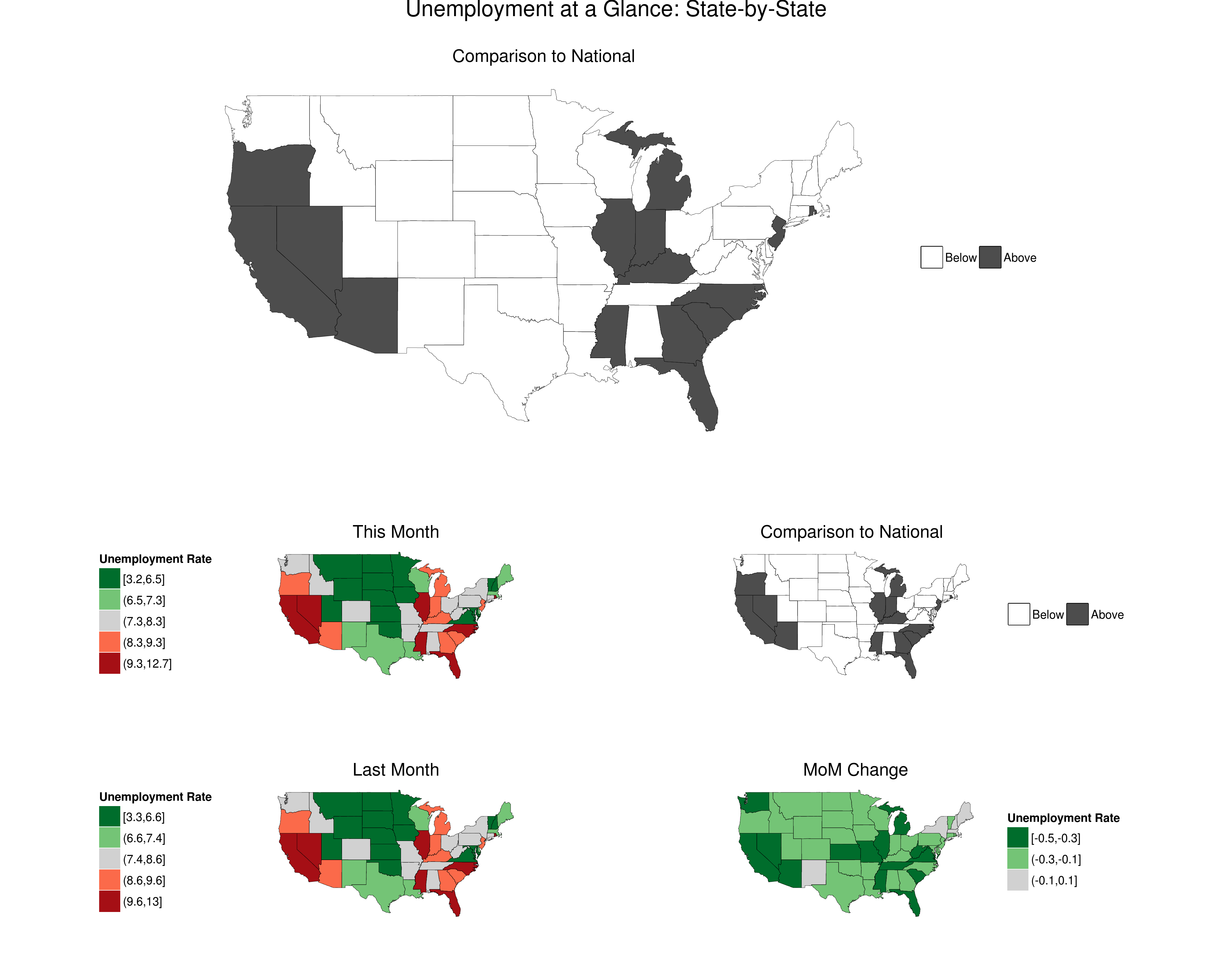
I spent the weekend playing with R's mapping capabilties. For most purposes, I think you can accomplish more writing raw SVG wrapped in a flash interface to allow easy web interactivity like what we did for CAFf. However, there are some applications for which a good static cloropleth map can be very useful---like when you want quick situational awareness of important numbers that change at slow frequency.
Following up on the first report series launched, the Arima Sector Forecast Reports, I'm going to add a regular GIS report to provide an at-a-glance view of US unemployment.
Here's a preview:
